
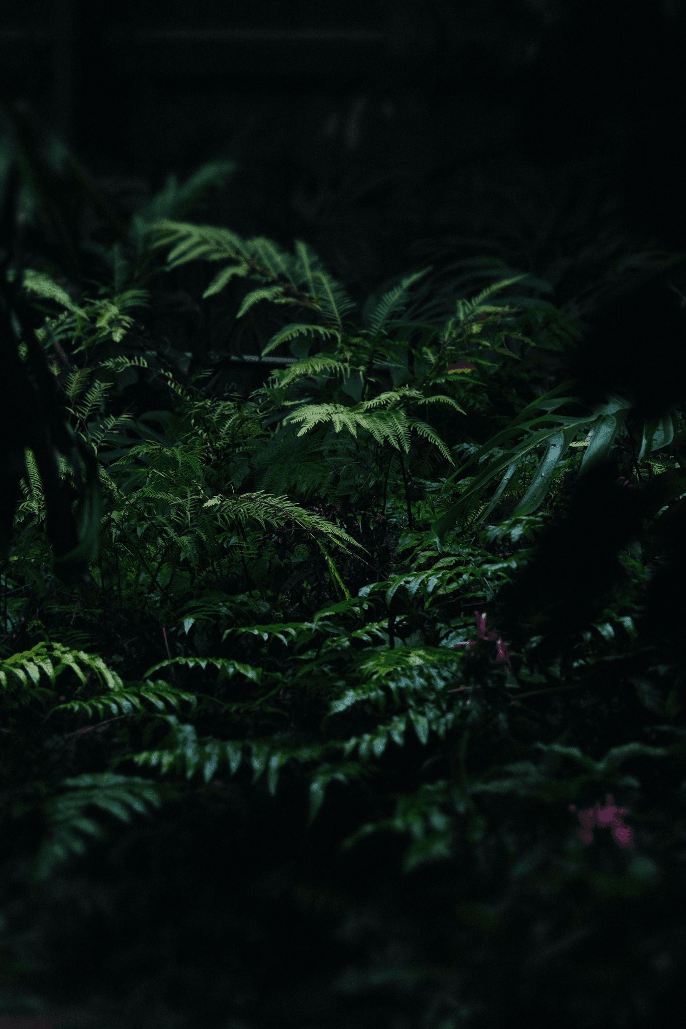
Introduction
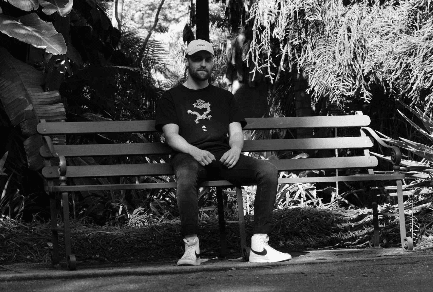
I'm Nathan Mitchell, also known as 'Nitche'.
A qualified designer based in Adelaide,
with over 10+ years of design experience.
I'm Nathan Mitchell,
also known as 'Nitche'.
A qualified designer based in Adelaide, with over 10+ years of design experience.
Creating amazing visuals!
Whether you’re launching a new product, managing a crisis, or building your brand’s narrative, I can design stories that captivate, influence, and resonate with your audience.
Creating amazing visuals!
Whether you’re launching a new product, managing a crisis, or building your brand’s narrative, I can design stories that captivate, influence, and resonate with your audience.
Collaborate with Me
Let’s create something extraordinary together! Whether you’re looking to visualize a product, design a concept, or build an interactive experience.
Collaborate with Me
Let’s create something extraordinary together! Whether you’re looking to visualize a product, design a concept, or build an interactive experience.
Portfolio
Featured Portfolio
Explore a collection of high-quality, innovative designs crafted to elevate brands and captivate audiences. Each project reflects my commitment to creativity and excellence.
Explore a collection of high-quality, innovative designs crafted to elevate
brands and captivate audiences
Each project reflects my commitment
to creativity and excellence.
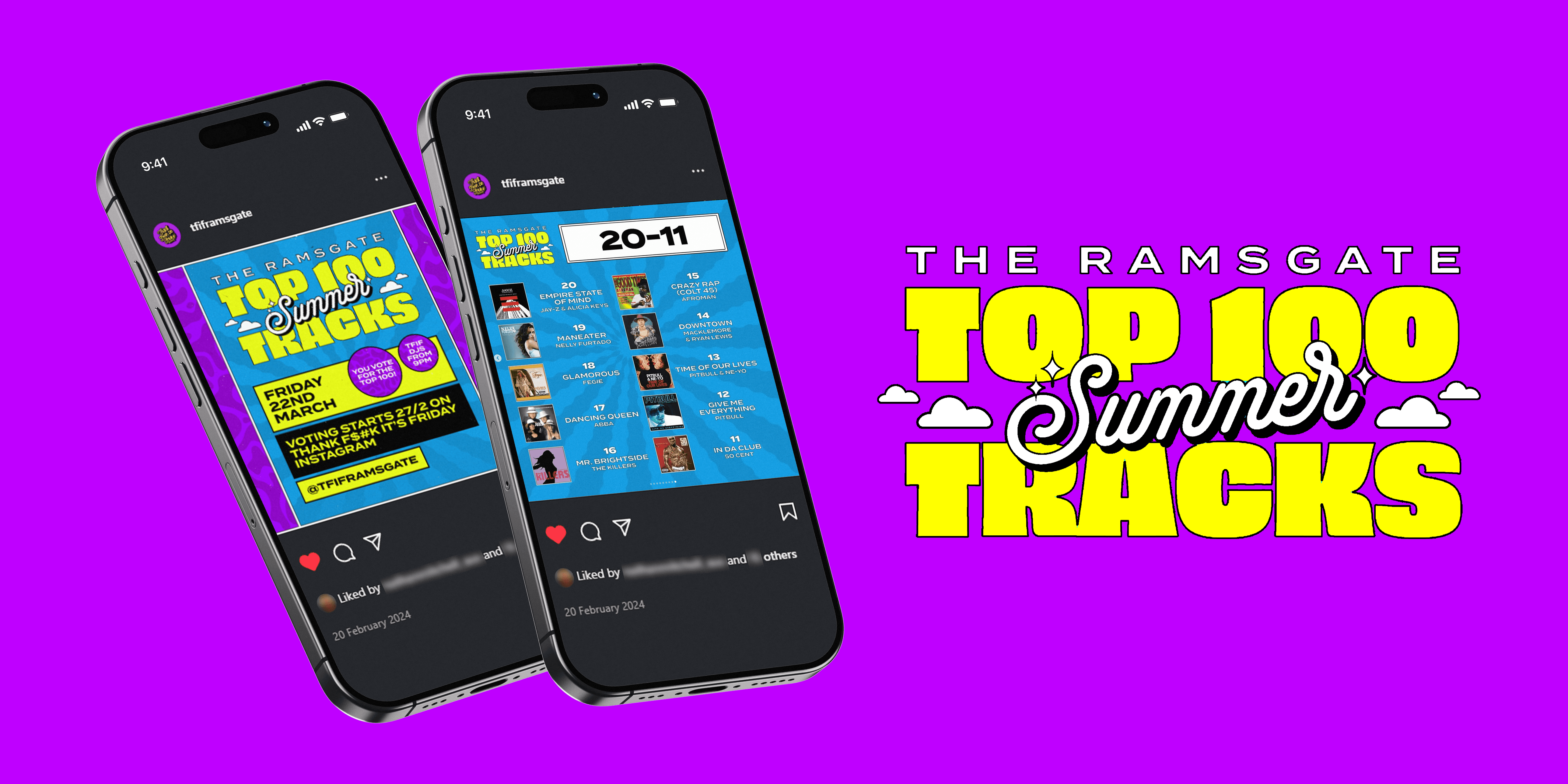
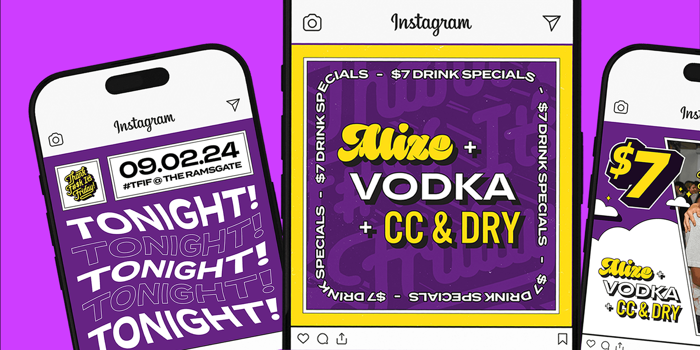
Thank F$#K It's Friday:
Social Media Management
& Content Creator
Contracted in-house social media management, content creation, and graphic design for Thank F$#K It's Friday at The Ramsgate (from December 2023 - August 2024)
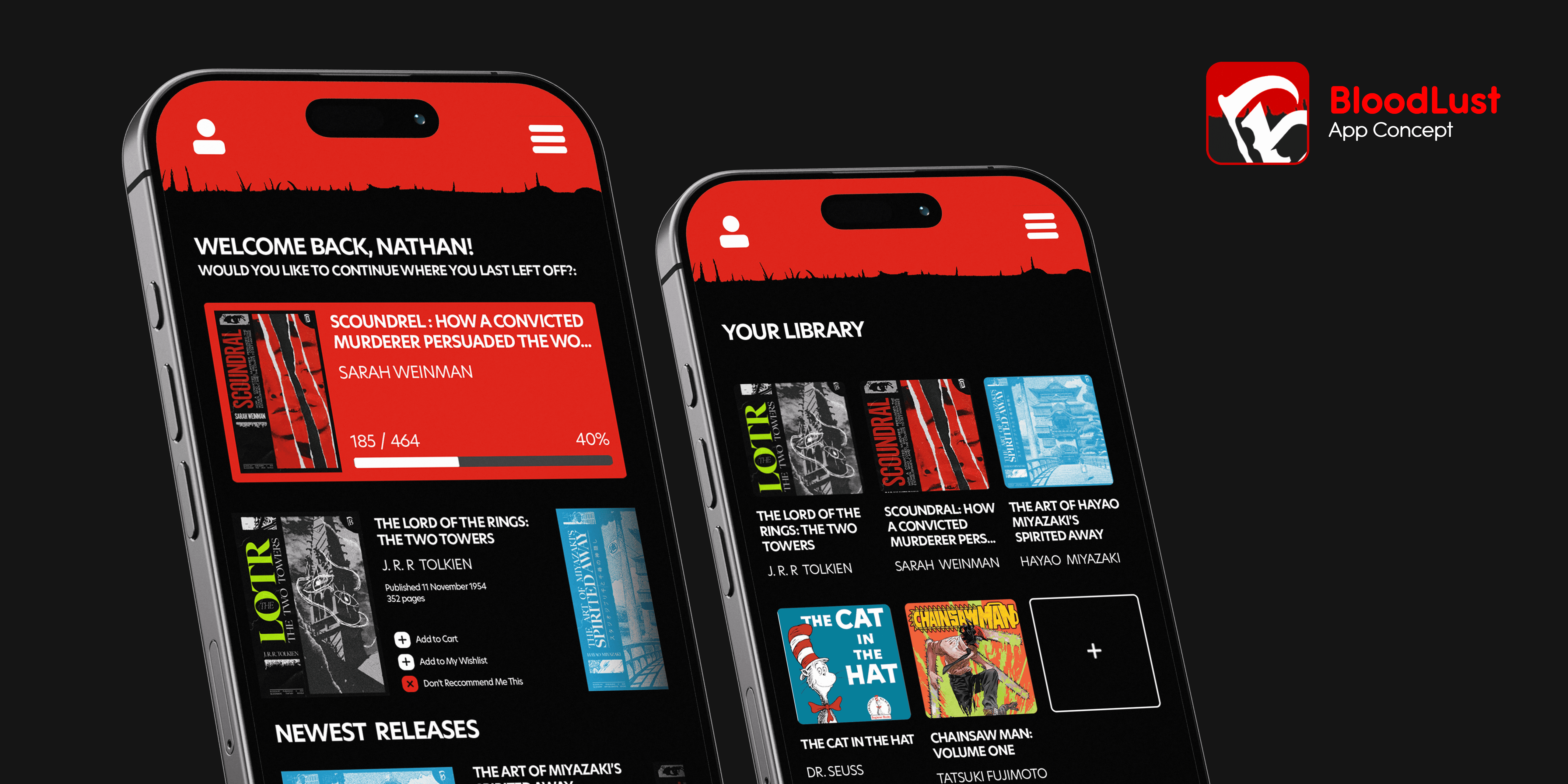
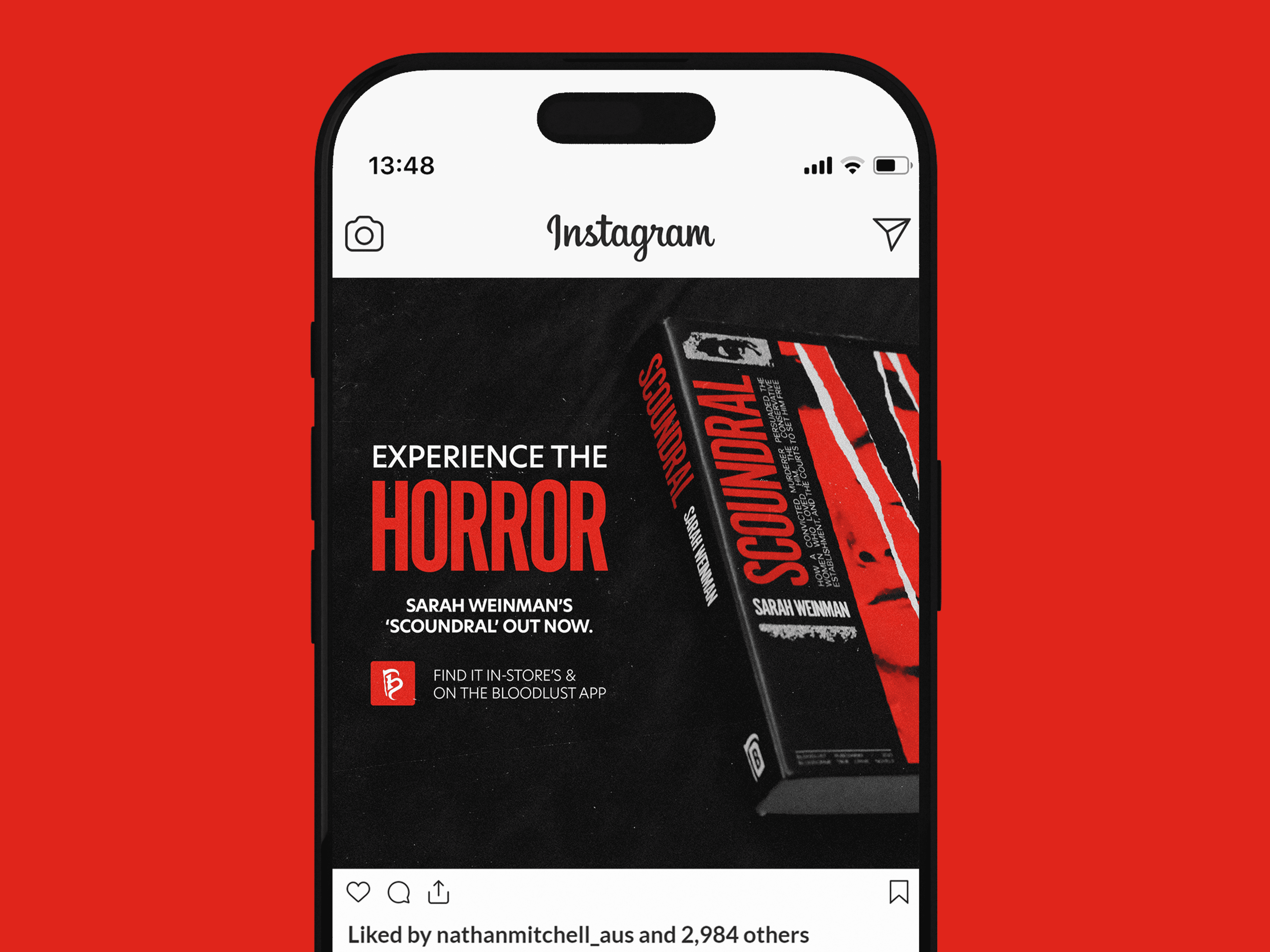
Bloodlust Publishing
University of South Australia
Nathan Mitchell Communication Design Studio 4 - Project 1: Book Publishing (50%) Promotional Campaign - Social Media Assets
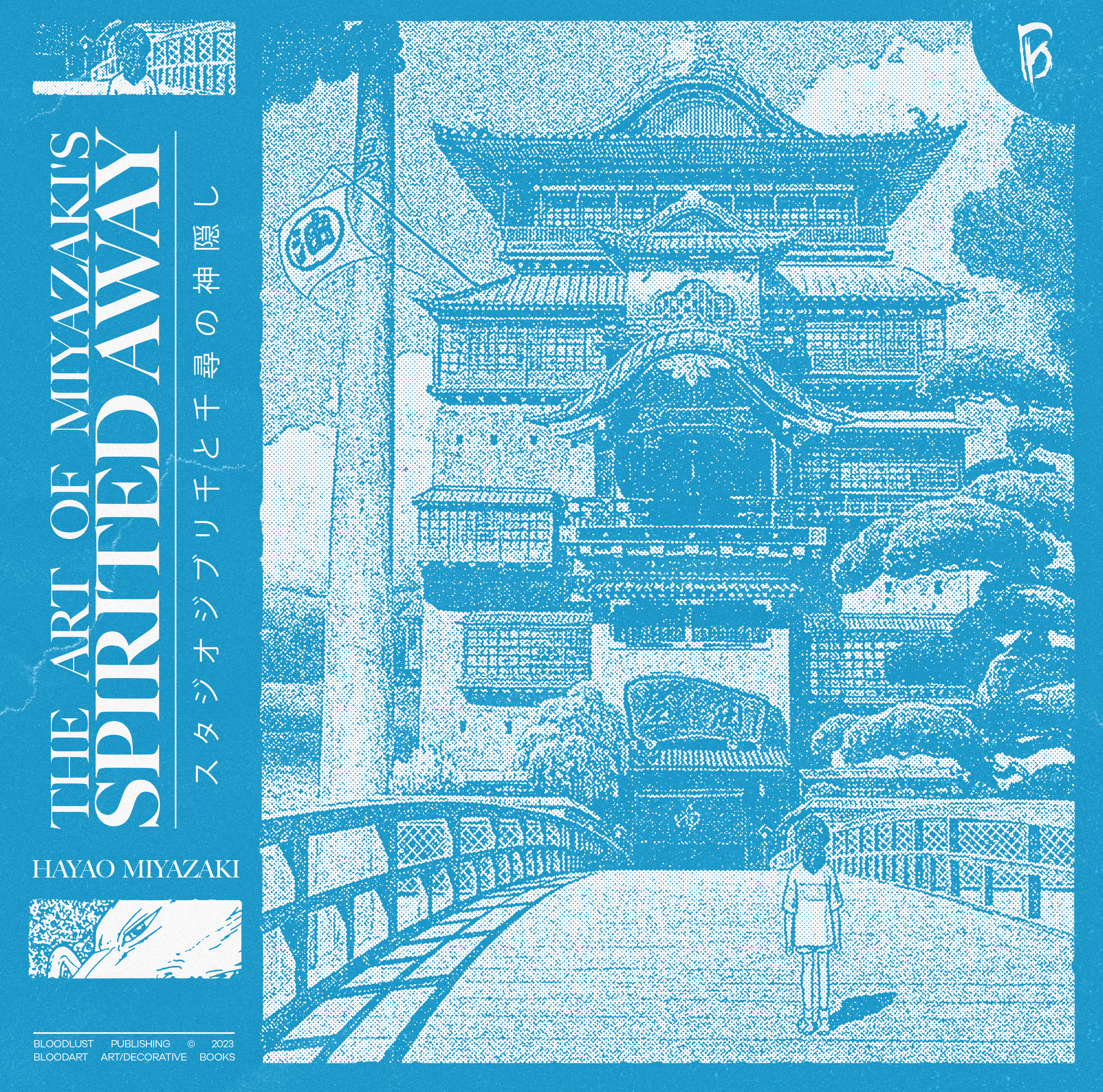
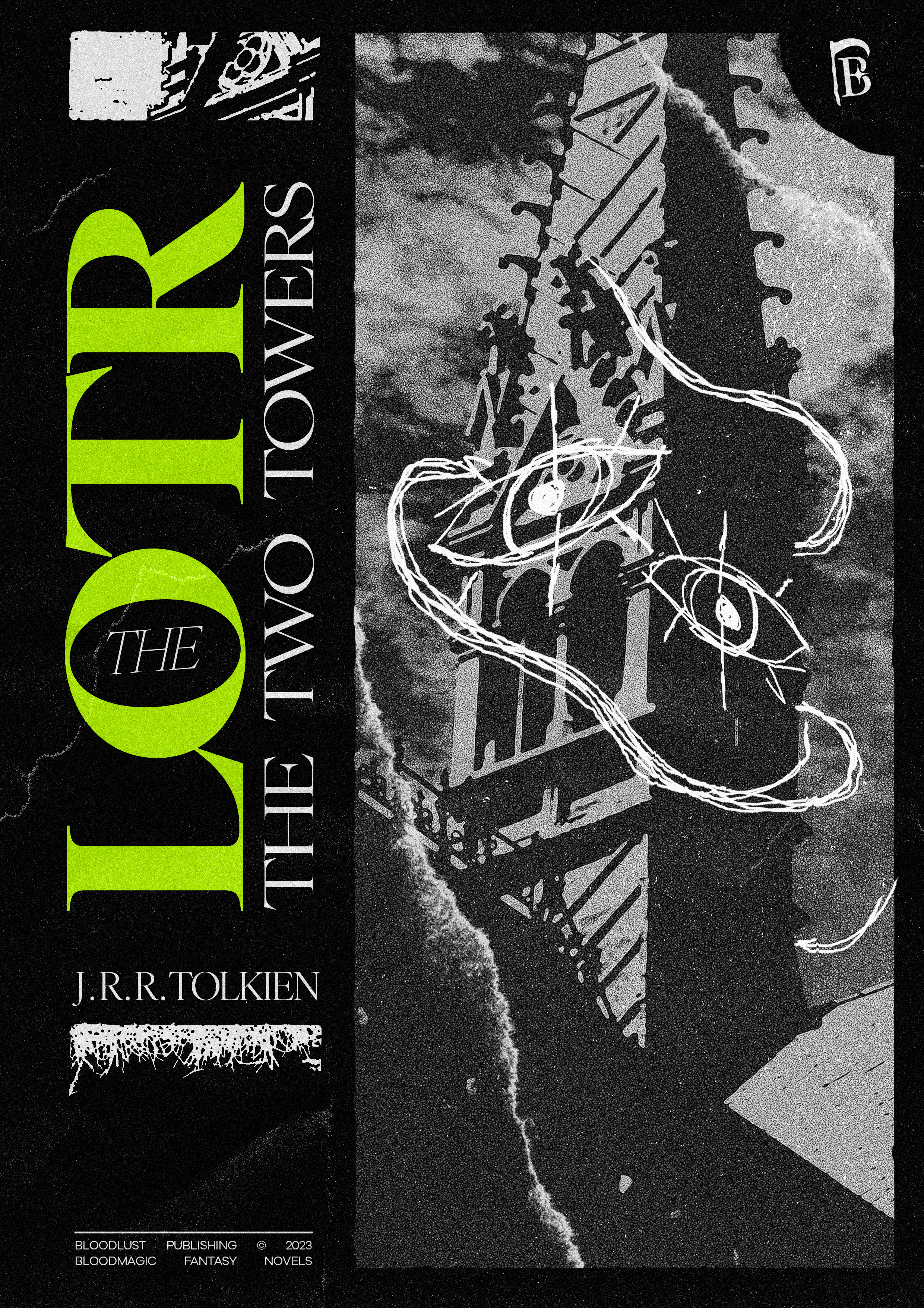
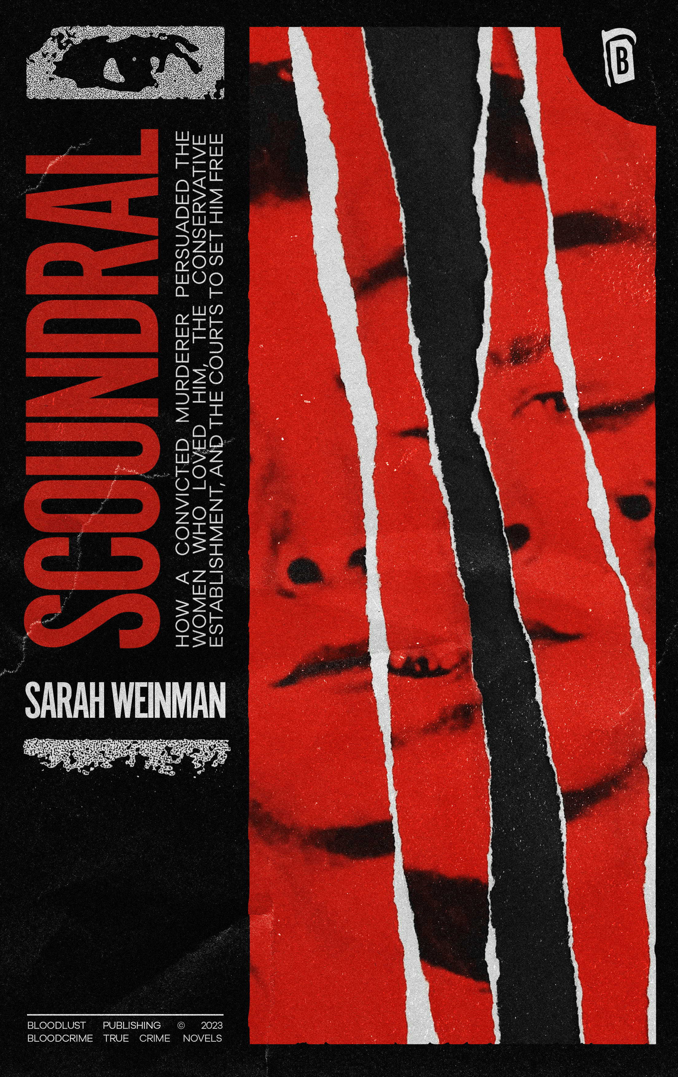

For this project in particular, I was tasked at creating a book publishing identity (incl. 3 imprints)
that targeted towards a specific demographic. The final assessment required 3 unique book covers, commercial & social media marketing assets, and a curated brand guideline.
Sticking to my guns, I wanted to do an aesthetic that was well within my comfort zone - primarily because it was 50% of my final grade.
The aesthetic I'd decided was a Brutalist design approach (a style I've grown to adopt); making use of raw textures, monochromatic palettes, and darker overtones that piece together to create a mature and gritty aesthetic - I believe perfect for readers aged 15–25; an audience drawn towards dark, edgy themes in horror and thriller literature.
In accordance, three imprints were created to reflect these: BloodCrime (True-Crime), BloodMagic (Fantasy/Surreal), and BloodArt (Art Showcase). These align with BloodLust, the parent company, and it's mission: to invite readers to discover new and compelling horror & thriller-related works.
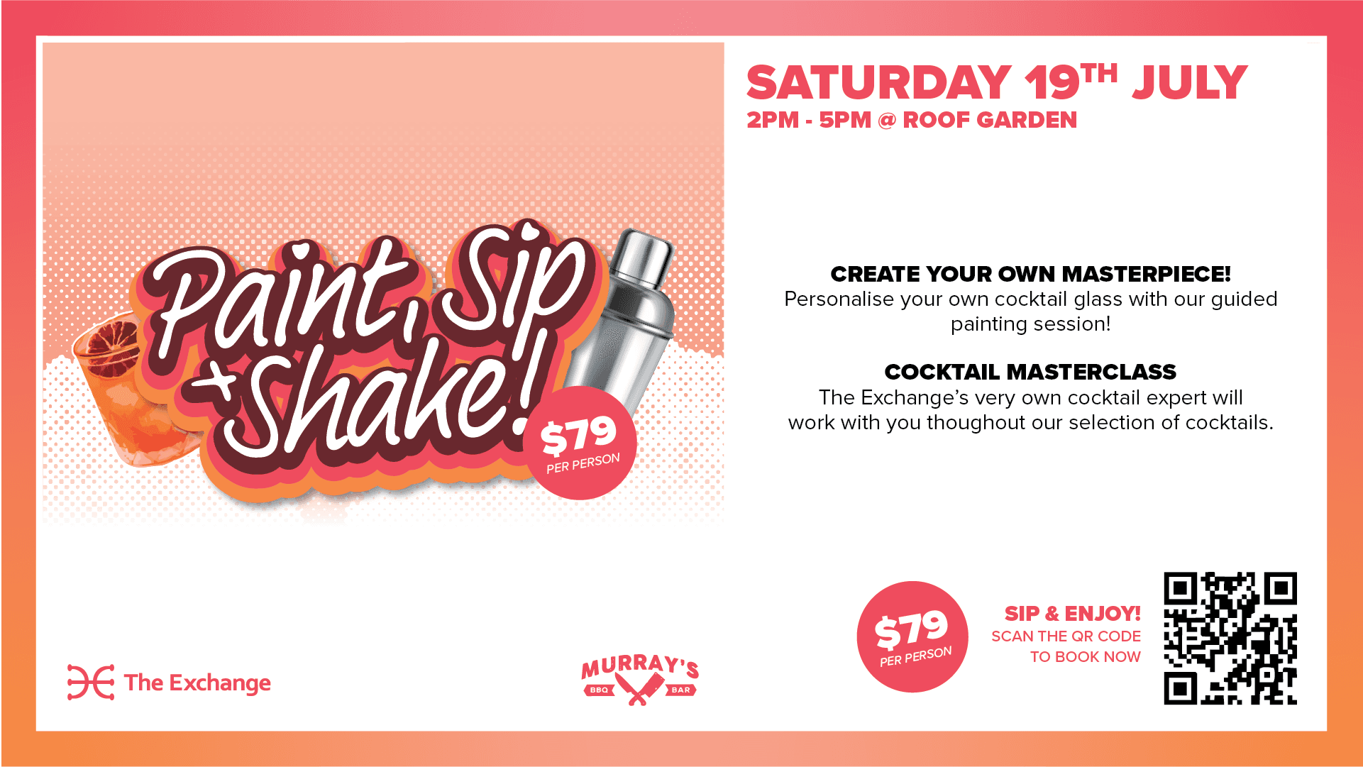
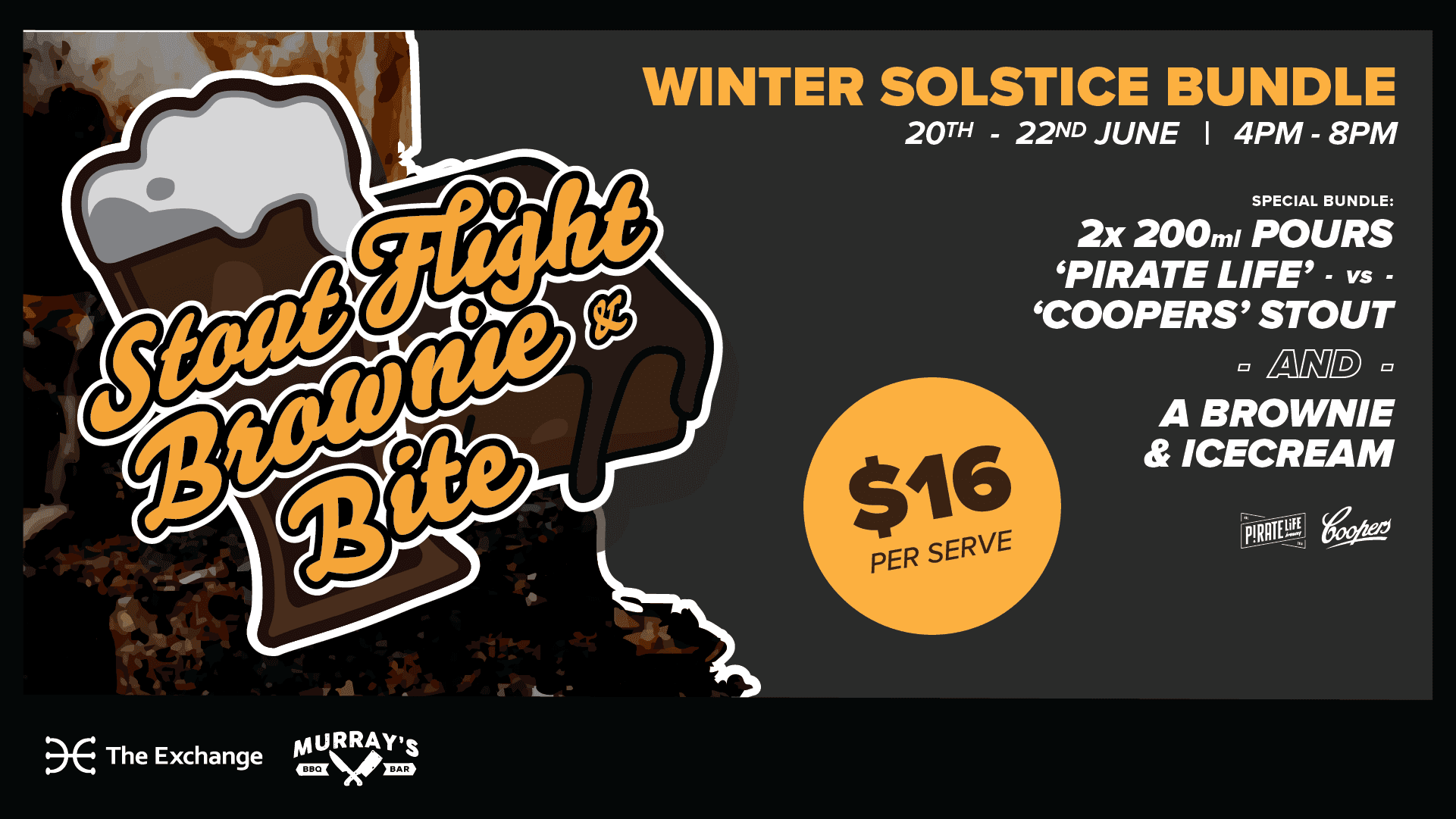
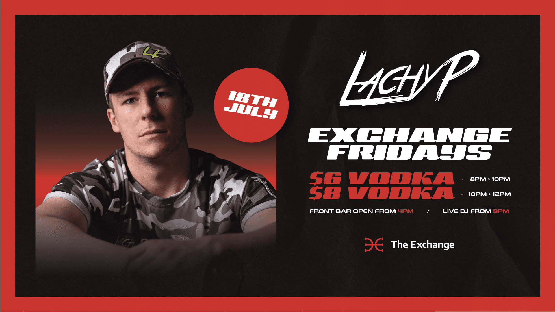
Exchange Hotel / Murray's BBQ & Bar:
Social Media Content Creator + Graphic Designer
Exchange Hotel / Murray's BBQ & Bar:
Content Creator + Graphic Designer
Contracted in-house social media content creation and graphic design for Exchange Hotel / Murray's BBQ & Bar (from June 2025 - August 2025)
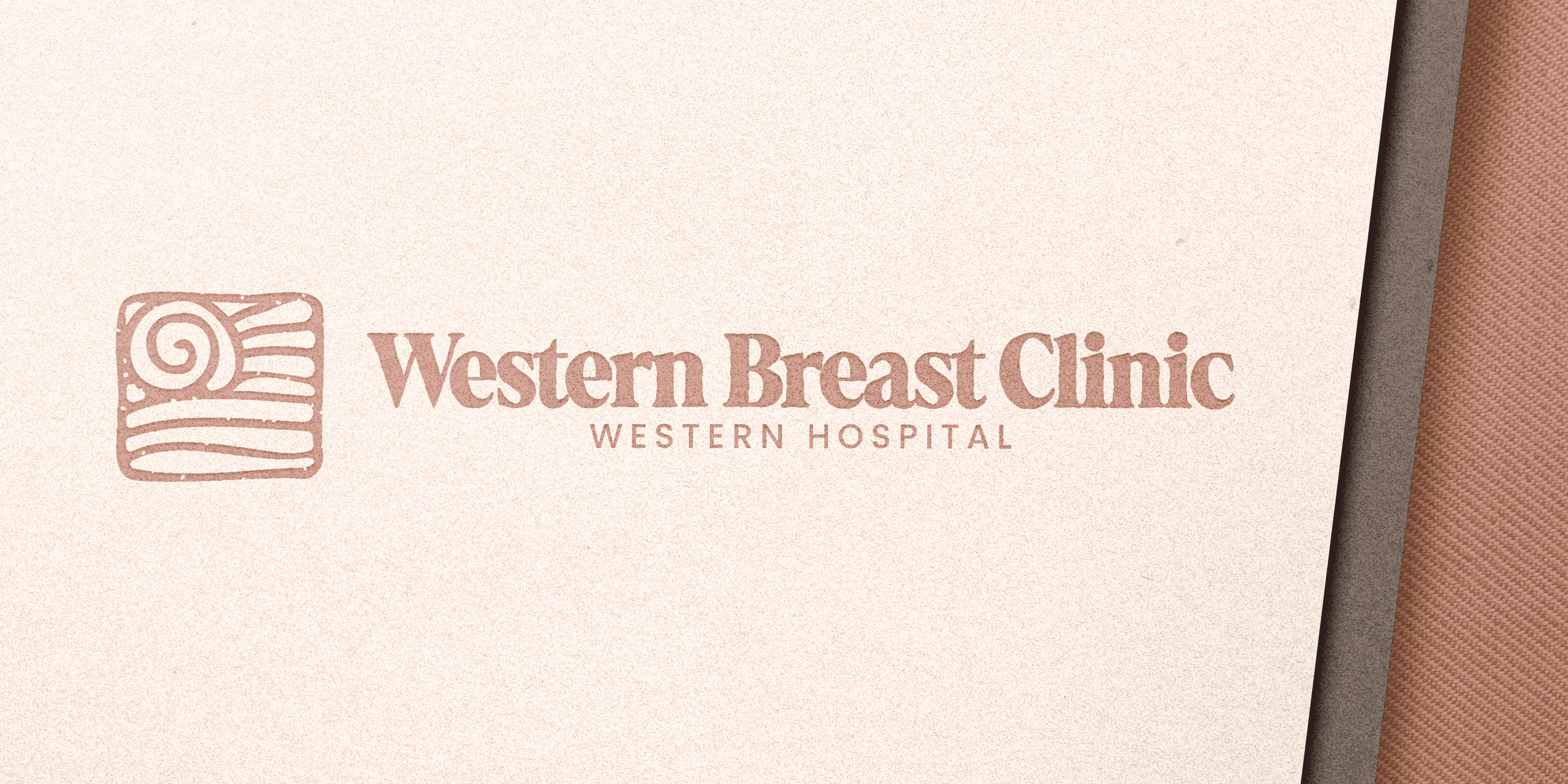
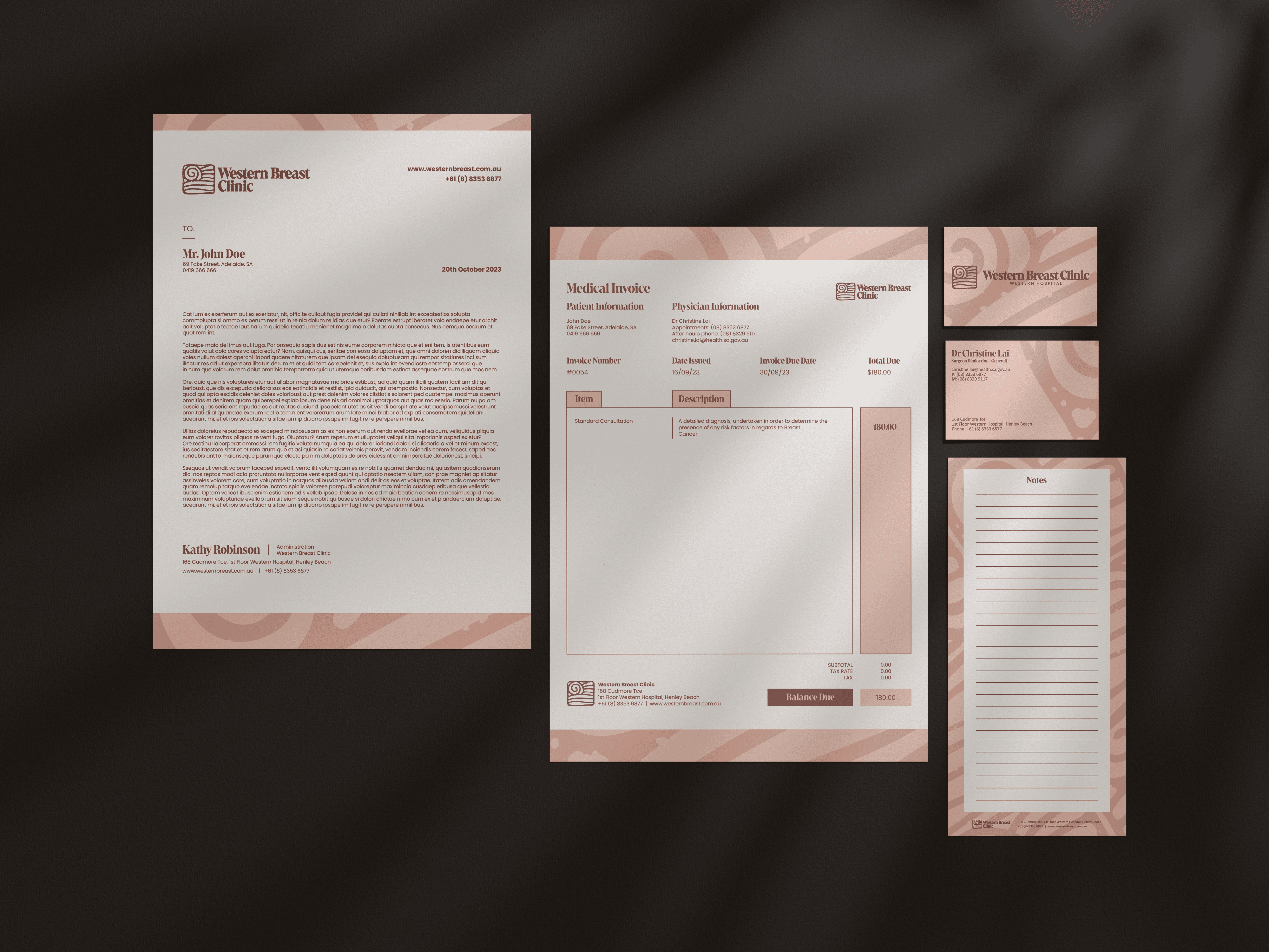
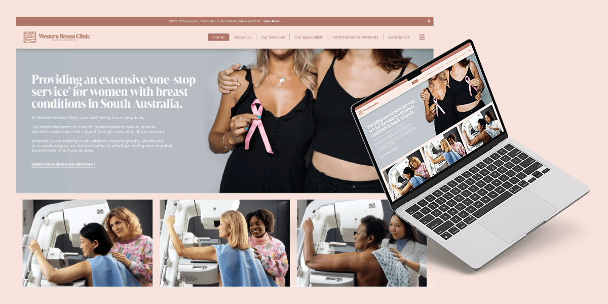
Western Breast Clinic
Research & Design
University of South Australia
Nathan Mitchell Communication Design Studio 4 Major Design Research Project: Brand Redesign & Strategy
For this project, the proposed re-brand for 'Western Breast Clinic' represented a journey aimed at enhancing the clinic’s visual and online identity, while reinforcing its core values of compassion, advanced medical services, comprehensive care, a skilled medical team, and support services.
The proposed imagery and visual style were carefully designed to present a softer and more approachable look to the clinic, compared to the initial visual identity of Western Breast Clinic.
Utilizing pastel colours, particularly shades of pink and brown, was perfect for conveying
a more nurturing and comforting look to the clinic. A softer approach reflected the clinic’s
commitment towards prioritization of customer care and well-being, as well as developing
an inviting environment for the safety and comfort of customers. To achieve this, the introduction
of new visual elements in various stationery items were created, such as business cards, ID cards,
invoice sheets, letterheads, branded hand sanitizers, personal notepads, and a complete website overhaul.
Bloodlust Publishing
University of South Australia
Nathan Mitchell Communication Design Studio 4 - Project 1: Book Publishing (50%) Promotional Campaign - Social Media Assets
For this project in particular, I was tasked at creating a book publishing identity (incl. 3 imprints)
that targeted towards a specific demographic. The final assessment required 3 unique book covers, commercial & social media marketing assets, and a curated brand guideline.
Sticking to my guns, I wanted to do an aesthetic that was well within my comfort zone - primarily because it was 50% of my final grade.
The aesthetic I'd decided was a Brutalist design approach (a style I've grown to adopt); making use of raw textures, monochromatic palettes, and darker overtones that piece together to create a mature and gritty aesthetic - I believe perfect for readers aged 15–25; an audience drawn towards dark, edgy themes in horror and thriller literature.
In accordance, three imprints were created to reflect these: BloodCrime (True-Crime), BloodMagic (Fantasy/Surreal), and BloodArt (Art Showcase). These align with BloodLust, the parent company, and it's mission: to invite readers to discover new and compelling horror & thriller-related works.
Western Breast Clinic
Research & Design
University of South Australia
Nathan Mitchell Communication Design Studio 4 Major Design Research Project: Brand Redesign & Strategy
For this project, the proposed re-brand for 'Western Breast Clinic' represented a journey aimed at enhancing the clinic’s visual and online identity, while reinforcing its core values of compassion, advanced medical services, comprehensive care, a skilled medical team, and support services.
The proposed imagery and visual style were carefully designed to present a softer and more approachable look to the clinic, compared to the initial visual identity of Western Breast Clinic.
Utilizing pastel colours, particularly shades of pink and brown, was perfect for conveying a more nurturing and comforting look to the clinic.
A softer approach reflected the clinic’s commitment towards prioritization of customer care and well-being, as well as developing an inviting environment for the safety and comfort of customers.
To achieve this, the introduction
of new visual elements in various stationery items were created, such as business cards, ID cards, invoice sheets, letterheads, branded hand sanitizers, personal notepads, and a complete website overhaul.
Gallery
Gallery
Gallery
Gallery

Contact Now
Contact Me!
Let’s create something amazing together! Reach out I’d love to hear about your project and ideas.
24/7 Full Time Support
24/7 Full Time Support
Available Worldwide
Available Worldwide